Every November, online stores publish the same kind of page: a holiday gift guide. "Gifts for Dad." "Stocking stuffers under $25." "The cozy edit." They're usually built quickly by marketing teams in a page builder, packed with lifestyle photos and banners, and then wrapped in a pop-up offering 15% off for an email address. They also tend to be the pages that skip accessibility review.
That's a problem, because a gift guide is often where a holiday shopper starts. If a screen reader user can't tell what's in the banner, or a keyboard user can't close the discount pop-up, they never reach the product, let alone the checkout. This checklist covers digital accessibility in retail for holiday landing pages: alt text for holiday promotions, keyboard navigation shopping flows, screen reader e-commerce basics and the parts of WCAG 2.2 that holiday marketing breaks most often.
Key takeaways
- If a banner says "40% off," the alt text has to say it too. Promotional text baked into an image is invisible to screen readers.
- A discount pop-up must take focus, keep it, close with Escape and give it back. Otherwise it can block the whole page.
- Product grids need real headings, descriptive link names and announced filter results.
- Festive design choices such as red-on-green text, falling snow and tiny close buttons are common WCAG failures.
In this checklist
Why holiday landing pages break
Holiday pages are usually built outside the normal development process. They're assembled from page builder blocks, uploaded banners and third-party marketing scripts, often in the last week before launch. Nobody intends to exclude anyone. The barriers creep in because the most common accessibility errors are exactly the ones these pages are built from.
Those figures are for home pages, which usually get the most attention. Seasonal landing pages get less. AudioEye's 2026 Digital Accessibility Index found that interior pages average about 10% more issues than home pages, and that 21% of detected issues stop people from completing purchases, submitting forms or accessing their accounts.
Alt text for holiday promotions
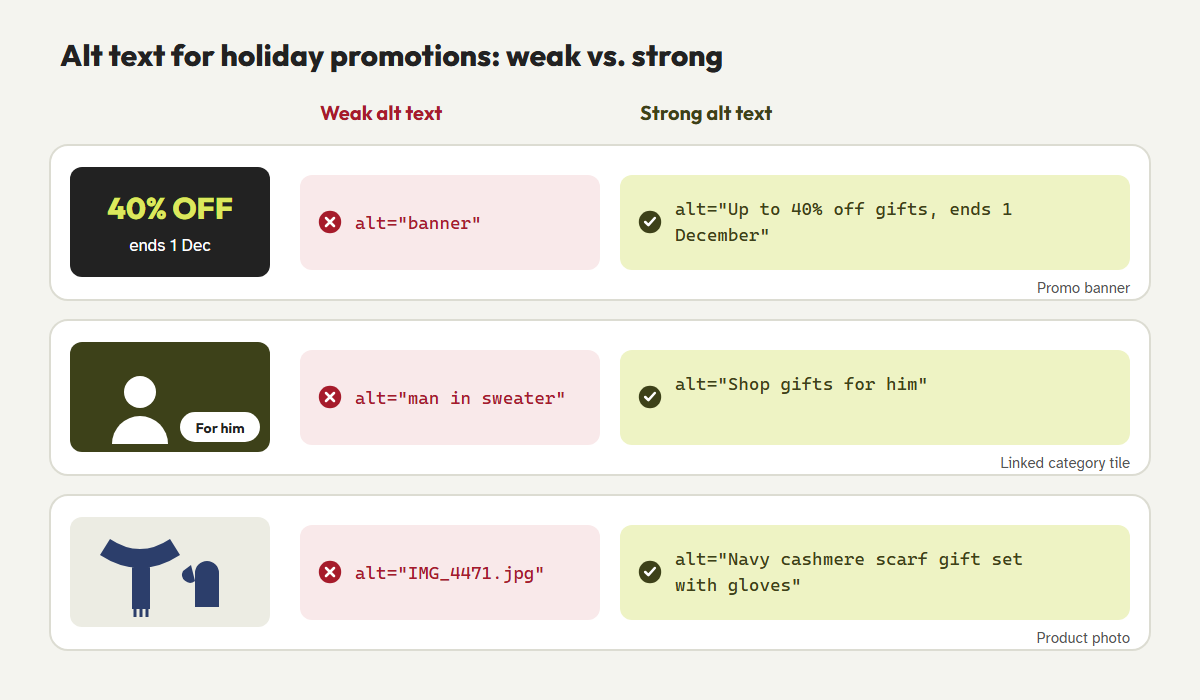
The most valuable words on a holiday page are often inside an image: the discount, the deadline, the free shipping cutoff. If that image has no alt text, or alt text like "banner" or "holiday-hero-final-v3.jpg," a screen reader user misses the offer entirely.
Use these rules for every image on a gift guide:
- Promotional banners: include every word in the image, in the same order. If the banner says "Up to 40% off gifts. Ends 1 December," so does the alt text.
- Linked images: describe where the link goes, not what the picture looks like. "Shop gifts for him" beats "Man smiling in a sweater."
- Product photos: name the product and the details a shopper would want, such as color, material or what's in the set.
- Decorative images: snowflakes, ribbons and background textures get an empty
alt=""so screen readers skip them. - Better still: put important offer text in real HTML text over the image. It's readable by everyone, translatable, zoomable and indexable by search engines.
Keyboard navigation shopping: discount pop-ups that don't trap people
The email-for-a-discount pop-up is the single biggest keyboard barrier on many holiday sites. A badly built one appears over the page but doesn't receive focus, so a keyboard user keeps tabbing through links hidden behind it. Or it receives focus but can't be closed, because the "×" is an icon in a <div> with no name and no keyboard support. Either way, the shopper is stuck.
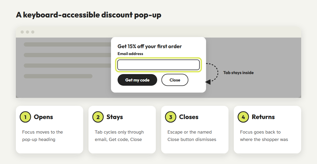
The modern HTML <dialog> element handles most of this for you when it's opened with showModal(). The rest of the page becomes inert, and Escape closes the dialog.
<dialog id="offer" aria-labelledby="offer-title">
  <h2 id="offer-title">Get 15% off your first order</h2>
  <form method="dialog">
    <label for="offer-email">Email address</label>
    <input id="offer-email" type="email" autocomplete="email">
    <button type="submit">Get my code</button>
    <button type="button" aria-label="Close offer" onclick="offer.close()">×</button>
  </form>
</dialog>
<script>
  const opener = document.activeElement;
  offer.showModal();
  offer.addEventListener('close', () => opener && opener.focus());
</script>
Also, think about timing. A pop-up that appears five seconds after the page loads interrupts a screen reader user mid-sentence. Showing it after a scroll or on a later page view is kinder to everyone. When the code is revealed, put it in real text that can be copied, not just in an image.
Screen reader e-commerce: make the gift grid make sense
A gift guide is a grid of product cards, filters and "Add to wishlist" hearts. Visually, it's easy to scan. With a screen reader, it can turn into a long list of "link, link, image, button, button."
- Use headings for each section, such as "Gifts under $25" or "For the home cook," so screen reader users can jump between them.
- Give each product card one clear link named after the product. Avoid repeated "Shop now" or "View" links with no context.
- Name icon buttons. A heart icon needs an accessible name like "Add Navy cashmere scarf to wishlist," and its pressed state should be announced.
- Announce filter results. When someone chooses "Under $50," use a status message to announce "24 gifts found" (WCAG 4.1.3).
- Make sale prices clear. A struck-through price isn't announced as "was." Add visually hidden text such as "Regular price $80, sale price $60."
- Give carousels a pause button, and don't let them rotate automatically for more than five seconds without one (WCAG 2.2.2).
WCAG 2.2 holiday marketing pitfalls
Several of the newer WCAG 2.2 success criteria are tripped by typical seasonal design. Check these before launch:
| Holiday pattern | The problem | WCAG |
|---|---|---|
| Red text on a green background | Low contrast, and indistinguishable for many people with color vision deficiency. | 1.4.3, 1.4.1 |
| Sticky "Free shipping ends tonight" bar | Covers the keyboard focus as people tab down the page. | 2.4.11 New in 2.2 |
| Tiny × on a pop-up or banner | Hard to hit for people with tremors or on touch screens. | 2.5.8 New in 2.2 |
| "Spin to win" or drag-to-reveal offers | Requires a dragging motion with no single-click alternative. | 2.5.7 New in 2.2 |
| Help link moves on the holiday page | Customers can't find support where they usually do. | 3.2.6 New in 2.2 |
| Falling snow and countdown animations | Distracting, and can't be paused. Respect prefers-reduced-motion. | 2.2.2 |
The one-page holiday accessibility checklist
Print this, or paste it into your launch ticket. Each check takes a few minutes per page.
- 1.1.1Every promotional image's alt text includes its offer text. Decorative images have
alt="". - 1.4.3Text, prices and buttons meet 4.5:1 contrast, including text placed over photos.
- 2.1.1Tab through the whole page. Every link, filter, heart and button works with a keyboard.
- 2.1.2Open and close every pop-up with a keyboard. Escape closes it and focus returns.
- 2.4.6Each gift section has a descriptive heading.
- 2.4.11Sticky bars never hide the focused element.
- 2.5.8Close buttons and small icons are at least 24 × 24 pixels.
- 4.1.2Icon buttons have names, and toggles announce their state.
- 4.1.3Filter results and "Added to cart" messages are announced.
- 2.2.2Carousels, timers and animations can be paused.
Selling into the EU? These pages are part of your e-commerce service under the European Accessibility Act. Our guide to EAA compliance and holiday checkout covers what regulators are testing.
Check your gift guide in minutes
CoreA11y scans holiday landing pages for missing alt text, contrast failures and unlabeled buttons, fixes common issues at the source and guides you through the keyboard checks a scanner can't do.
Scan your holiday pagesRead the Shopify holiday guideFrequently asked questions
How long should alt text be for a promotional banner?
As long as it needs to be to include the banner's text and purpose, and no longer. Skip phrases like "image of." If a banner holds a lot of text, that's a sign the text belongs in HTML instead.
Are email pop-ups bad for accessibility?
Not by themselves. An accessible pop-up moves focus in, has a labeled field and a named close button, closes with Escape and returns focus. Problems come from pop-ups that skip those steps.
Do holiday landing pages need to meet WCAG if they're only live for a month?
Yes. Accessibility laws apply to whatever is live, and a temporary page with heavy traffic can affect more shoppers than a permanent page nobody visits.
Should I add an accessibility widget for the holidays?
No. Widgets and overlays don't fix the underlying markup and can introduce new problems. See our post on why overlays are a legal risk.
References
- WebAIM, "The WebAIM Million: 2026 report." webaim.org/projects/million
- AudioEye, "2026 Digital Accessibility Index," June 2026. prnewswire.com
- W3C, "Web Content Accessibility Guidelines (WCAG) 2.2." w3.org/TR/WCAG22
- W3C WAI, "Images Tutorial: Functional Images and Images of Text." w3.org/WAI/tutorials/images
- W3C WAI-ARIA Authoring Practices, "Dialog (Modal) Pattern." w3.org
- MDN Web Docs, "<dialog>: The Dialog element." developer.mozilla.org
- W3C, "Understanding Success Criterion 4.1.3: Status Messages." w3.org